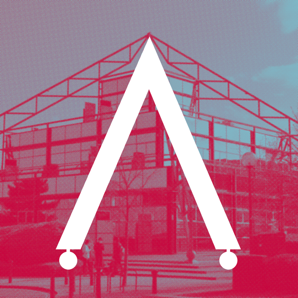
An architectural font inspired by The Point – yet another way in which this iconic structure has inspired art and creativity in Milton Keynes.
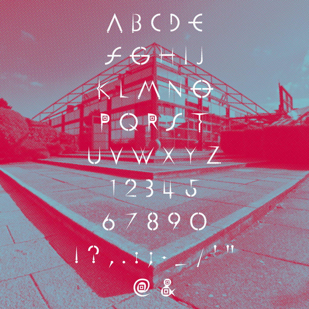
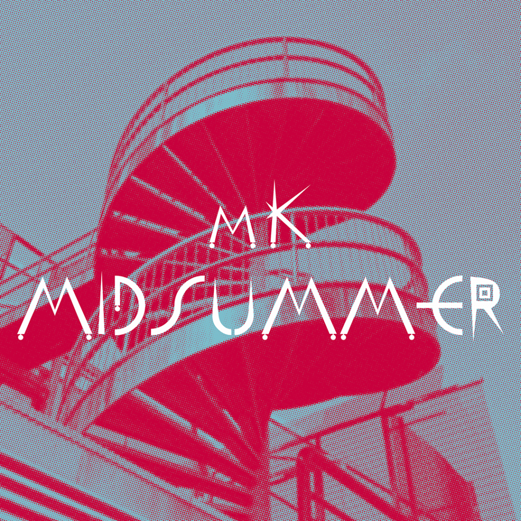
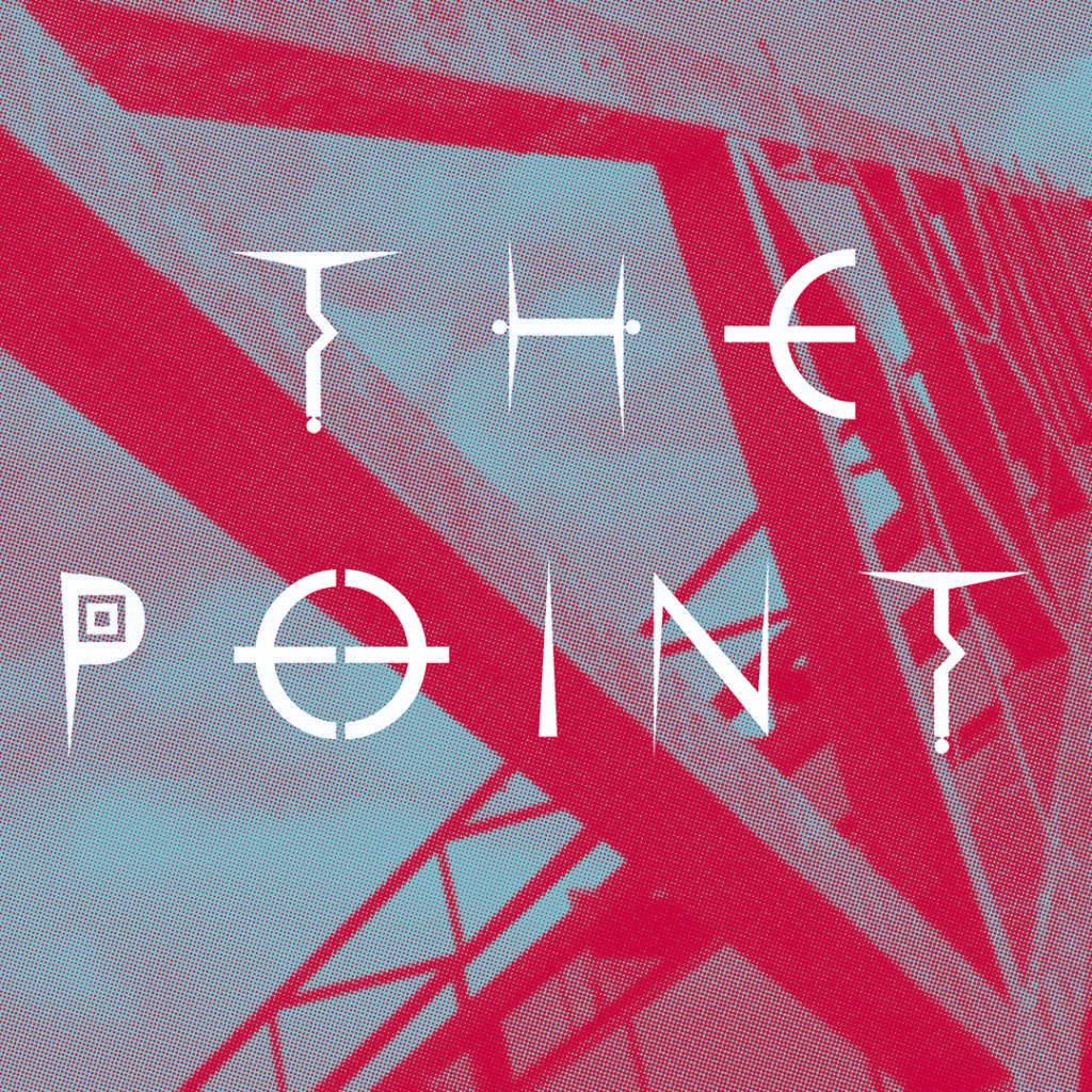

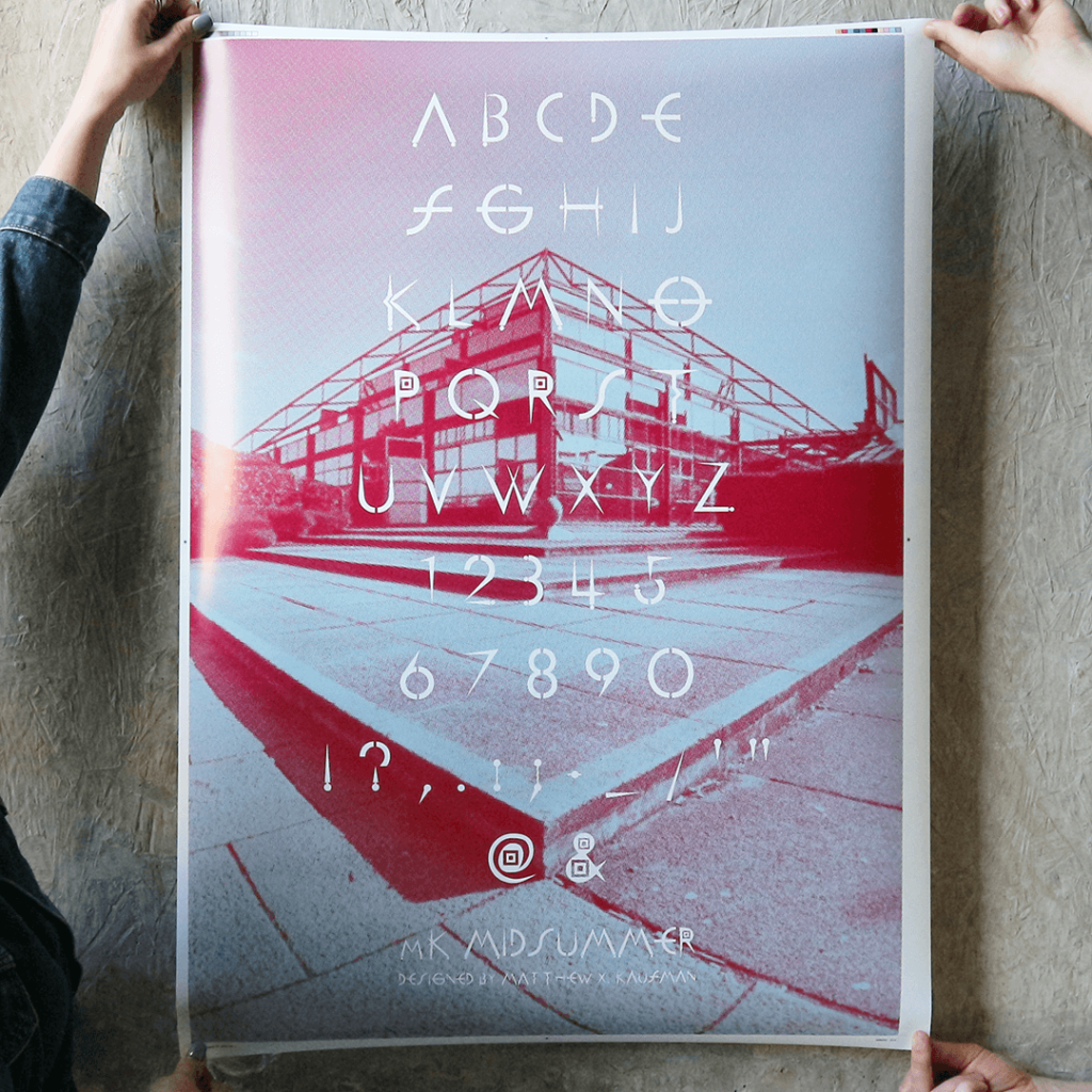
Designer Matthew Alexander Kaufman is no stranger to MK and The Point, and before completing his bachelor’s degree in Graphic Design at the Manchester School of Art as a mature student in 2021 he was tasked with designing a typeface based on an iconic piece of architecture for his final project – the result is MK Midsummer.
Matt has made the font available for free under the Creative Commons Attribution 4.0 International (CC BY 4.0) and requested that we help distribute it.
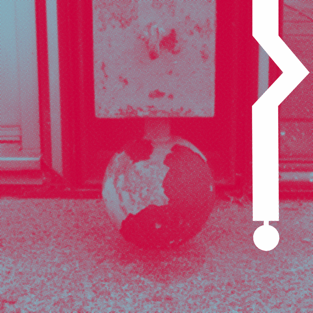
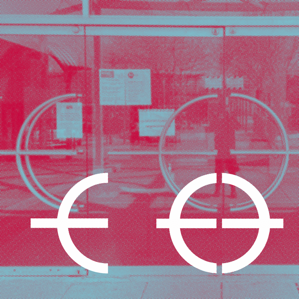
I created a typeface based on an iconic piece of architecture: The Point in Milton Keynes, the UK’s first multiplex cinema. Operating between 1985–2015, this red neon pyramidal ziggurat inspired me to make an angular font (‘Midsummer’), cut through with a sense of playfulness and just touch of nostalgia.
I got to visit The Point at the end of April to take the pictures for the project. Such a sorry state of disrepair! It would be wonderful to see it back in action in some form again one day.
Matthew Kaufman